BlogSheet Week 10
Blogsheet week 10
In this week’s lab, you will collect more data on low pass
and high pass filters and “process” them using MATLAB.
PART A: MATLAB
practice.
1.
Open MATLAB. Open the editor and copy paste the
following code. Name your code as FirstCode.m
Save the resulting plot as a JPEG image and
put it here.
clear all;
close all;
x = [1 2 3 4 5];
y = 2.^x;
plot(x, y, 'LineWidth', 6)
xlabel('Numbers', 'FontSize', 12)
ylabel('Results', 'FontSize', 12)


Image 1.1 Graph of Code above in Matlab
2.
What does clear
all do?
Clears all objects in the Matlab workspace and closes the Mupad engine that is associated with the workspace and resets all the assumptions.
Clears all objects in the Matlab workspace and closes the Mupad engine that is associated with the workspace and resets all the assumptions.
3.
What does close
all do?
Close all is the equivalent of clear all and will do the same as clear all.
Close all is the equivalent of clear all and will do the same as clear all.
4.
In the command line, type x and press enter. This is a matrix. How many rows and columns are
there in the matrix?
There are 5 columns and 1 row in the matrix created in x.
There are 5 columns and 1 row in the matrix created in x.
5.
Why is there a semicolon at the end of the line
of x and y?
Semicolons are used to seperate rows to create an array, they can also be used to suppress code output, and also suppress code on a single line.
Semicolons are used to seperate rows to create an array, they can also be used to suppress code output, and also suppress code on a single line.
6.
Remove the dot on the y = 2.^x; line and execute
the code again. What does the error message mean?
The . is used for elementwise power. Without the '.' is using power in matrix form. So the matrix must be a square matrix meaning it must have the same number or rows and columns.
The . is used for elementwise power. Without the '.' is using power in matrix form. So the matrix must be a square matrix meaning it must have the same number or rows and columns.
7.
How does the LineWidth affect the plot? Explain.
Changing the LineWidth makes the graphs line objects thicker or thinner, and the lines cannot be made invisible by making the linewidth zero, linesvisible=False would have to be used. Note that changing the linewidth does not affect the width of the lines in the axes.
Changing the LineWidth makes the graphs line objects thicker or thinner, and the lines cannot be made invisible by making the linewidth zero, linesvisible=False would have to be used. Note that changing the linewidth does not affect the width of the lines in the axes.
8.
Type help
plot on the command line and study the options for plot command. Provide how you would change the line for plot command to obtain the following
figure (Hint: Like ‘LineWidth’, there
is another property called ‘MarkerSize’)
In the code line with plot we added 'ro-' and 'Markersize', 12 and changed to 'Linewidth', 4 to obtain this plot below.
In the code line with plot we added 'ro-' and 'Markersize', 12 and changed to 'Linewidth', 4 to obtain this plot below.

9.
What happens if you change the line for x to x
= [1; 2; 3; 4; 5]; ? Explain.
When it is typed
in this way x = [1 2 3 4 5];, x and y values will be in row. By adding (;)
between the values it will make appear as a column.
10. Provide
the code for the following figure. You need to figure out the function for y.
Notice there are grids on the plot.
Here is the code we used to achieve the graph below.
clear all;
close all;
x = [1; 2; 3; 4; 5];
y = x.^2;
plot(x, y, 'ks:', 'LineWidth', 5, 'MarkerSize', 16)
xlabel('Numbers', 'FontSize', 12)
ylabel('Results', 'FontSize', 12)
grid on;
Here is the code we used to achieve the graph below.
clear all;
close all;
x = [1; 2; 3; 4; 5];
y = x.^2;
plot(x, y, 'ks:', 'LineWidth', 5, 'MarkerSize', 16)
xlabel('Numbers', 'FontSize', 12)
ylabel('Results', 'FontSize', 12)
grid on;

11. Degree
vs. radian in MATLAB:
a.
Calculate sinus of 30 degrees using a calculator
or internet.
Using a calculator,
Sin(30)=0.5 degree.
Sin(30)=-0.988
radian.
b.
Type sin(30) in the command line of the MATLAB. Why
is this number different? (Hint: MATLAB treats angles as radians).
If it is typed
sin(30) it will be treated as radians, and by typing it sind(30) we will get
the same answer that we got in the calculator which is 0.5 degree.
c.
How can you modify sin(30) so we get the correct
number?
By adding d which is referring
to degree. So, it will look like this sind(30).
12. Plot
y = 10 sin (100 t) using Matlab with
two different resolutions on the same
plot: 10 points per period and 1000 points per period. The plot needs to
show only two periods. Commands you
might need to use are linspace, plot, hold on, legend, xlabel, and ylabel.
Provide your code and resulting figure. The output figure should look like the
following:
This is our code to provide the same plot with different resolutions. This code should create the plot below.
t1 = linspace(0, .125, 10),
t2 = linspace(0, .125, 1000),
y1 = 10*sin(100*t1);
y2 = 10*sin(100*t2);
plot(t1, y1, 'ro-',t2, y2, 'k')
xlabel('Time(s)');
ylabel('y function');
axis([0 .14 -10 10])
legend('Coarse','Fine')

13. Explain
what is changed in the following plot comparing to the previous one.
The 'fine' line plot is for when y is greater than 5 then y = 5. So it caps the value of y on the 'fine' line to a maximum value of 5.
The 'fine' line plot is for when y is greater than 5 then y = 5. So it caps the value of y on the 'fine' line to a maximum value of 5.

14. The
command find was used to create this
code. Study the use of find (help find)
and try to replicate the plot above. Provide your code.
t1 = linspace(0, .125, 10),
t2 = linspace(0, .125, 1000),
y1 = 10*sin(100*t1);
y2 = 10*sin(100*t2);
f=find(y2>5);
y2(f)=5;
plot(t1, y1, 'ro-',t2, y2, 'k')
xlabel('Time(s)');
ylabel('y function');
axis([0 .14 -10 10])
legend('Coarse','Fine')
PART B: Filters and
MATLAB
1.
Build a low pass filter using a resistor and
capacitor in which the cut off frequency is 1 kHz. Observe the output signal
using the oscilloscope. Collect several data points particularly around the cut
off frequency. Provide your data in a table.


Table 1.1 Low Pass Filter
2.
Plot your data using MATLAB. Make sure to use
proper labels for the plot and make your plot line and fonts readable. Provide
your code and the plot.

Frequency = [100 200 300 400 500 600 700 800 900 1000 1100 1200];
Output = [0.98 0.96 0.94 0.90 0.86 0.79 0.78 0.74 0.70 0.66 0.63 0.6];
plot(Frequency, Output, 'o-r')
xlabel('Frequency');
ylabel('Vout/Vin');

Graph 2.1 Low Pass Filter
3.
Calculate the cut off frequency using MATLAB. find command will be used. Provide your
code.

Frequency = [100 200 300 400 500 600 700 800 900 1000 1100 1200];
Output = [0.98 0.96 0.94 0.90 0.86 0.79 0.78 0.74 0.70 0.66 0.63 0.6];
plot(Frequency, Output, 'o-r')
xlabel('Frequency');
ylabel('Vout/Vin');
s=find(y>0.7);
s=find(y<0.72);
a=x(s);
cutoff=min(a)

Photo 3.1 calculating cut of frequency using MATLAB (Low Pass)
4.
Put a horizontal dashed line on the previous
plot that passes through the cutoff frequency.

Frequency = [100 200 300 400 500 600 700 800 900 1000 1100 1200];
Output = [0.98 0.96 0.94 0.90 0.86 0.79 0.78 0.74 0.70 0.66 0.63 0.6];
plot(Frequency, Output,'o-r')
xlabel('Frequency');
ylabel('Vout/Vin');
hold on
hline = refline(0,0.7);
set(hline, 'linestyle','--')
xlabel('Frequency');
ylabel('Vout/Vin');

Graph 4.1 shows the
5.
Repeat 1-3 by modifying the circuit to a high
pass filter.


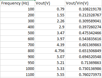
Table 5.1 High Pass Filter
Frequency = [100 200 300 400 500 600 700 800 900 1000 1100 1200];
Output= [0.10 0.21 0.30 0.39 0.47 0.54 0.60 0.65 0.69 0.71 0.73 0.76];
plot(Frequency, Output, 'o-r')
xlabel('Frequency');
ylabel('Vout/Vin');

Graph 5.1 High Pass Filter
requency = [100 200 300 400 500 600 700 800 900 1000 1100 1200];
Output= [0.10 0.21 0.30 0.39 0.47 0.54 0.60 0.65 0.69 0.71 0.73 0.76];
plot(Frequency, Output, 'o-r')
xlabel('Frequency');
ylabel('Vout/Vin');
s=find(y>0.7);
s=find(y<0.72);
a=x(s);
cutoff=min(a)

Photo 5.1 calculating cut of frequency using MATLAB (High Pass)
I noticed that your group's cut-off frequency wasn't quite 1 kHz (like my group's). Do you think this is because of the combination of resistance and capacitance or because of some other aspect of the experiment?
ReplyDeleteI think this is due to the combination of resistance and capacitance which make more sense.
DeleteThanks..
Even though all of our table values are different, each graphs representing the tables have the same curve and slope. Id be curious to know what resistor and capacitor combination you guys used to compare it to our values to figure out why our points differ so much.
ReplyDeleteI think the graphs are smellier to each other, but not the same. I guess there is a difference. I remember, R=82, C=20*10^9.
DeleteThanks..
Great job with formatting, we used highlighting to help display our code, but yours was not confusing like some other groups blogs. it seems like you guys might be missing some answers for the first couple of questions. However, your plots and data seem to check out for question 14, Good Job.
ReplyDeleteI am not sure which question you mean! I checked the blog again, and every question was answered.
DeleteThanks..
Our answers for part A seem to match up correctly. I really like the format of your blog with the bolded answers. We have it the opposite way, but I think yours looks better. Your data for part B seems to match up correctly with everyone else’s. We did ours a little wrong so I would not compare it to us. Your graphs don't seem as linear as some of the other groups, but they are still good I would assume.
ReplyDeleteI guess when you have bolded answer, it would be more clear. I hope it still right.
DeleteThanks.